-
If you’re thinking about refreshing the look of your home over the coming months, you might want to consider the latest colour forecast by Dulux New Zealand. Not only is it visually inspiring, but it will bring you up to speed with the home colour trends 2018 has in line for us.
The 2018 Dulux Colour Trends Forecast, Balance, is made up of four themes; Essential, Kinship, Escapade and Reflect, each inspired by a desire for balance.
“Balance is desired in many areas of our lives, whether it be at work, at home with family, our lifestyle, or simply within ourself,” the forecast says.“With future interiors in mind, the idea of balance is crucial to ensure we live and work in harmonious spaces that help to stimulate our senses, as well as enabling us to relax and retreat.”
We’ve detailed each of the themes below; for those looking for style inspiration for their new build, renovation, or just those wanting to see what home colour trends 2018 has in store for us.Kinship
Inspired by a desire to “switch off” from the noise and negativity so often filling our modern-day newsfeeds, Kinship has a focus on creating space for “compassion and kindness, truth and transparency.” “In doing so we find new joy in reviving long-held traditions and cultural influences igniting our sense of community and kinship,” the forecast says. The palette is made up of terracottas, soft greys, grey greens and neutrals, as well as a colourful mix of folklore influences.Reflect
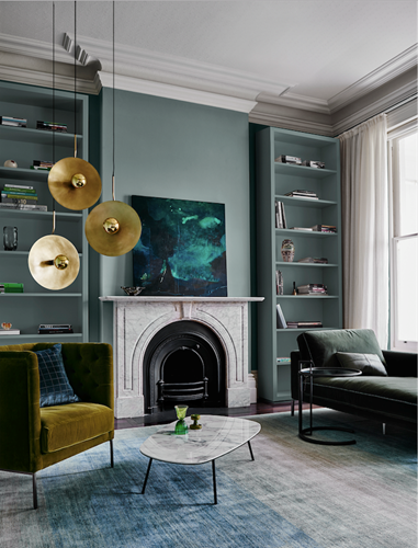
Incorporating greens, warm pinks and purple hues, Reflect was formed on a vision to reconnect with design features of the past. Featuring a hint of nostalgia, 1970s glamour, 90s swagger and the elegance of the 30s and 50s. “As smart technology reshapes the look and feel of our everyday life, we take the opportunity to reflect and reconnect with design icons of our past,” the forecast says.Escapade
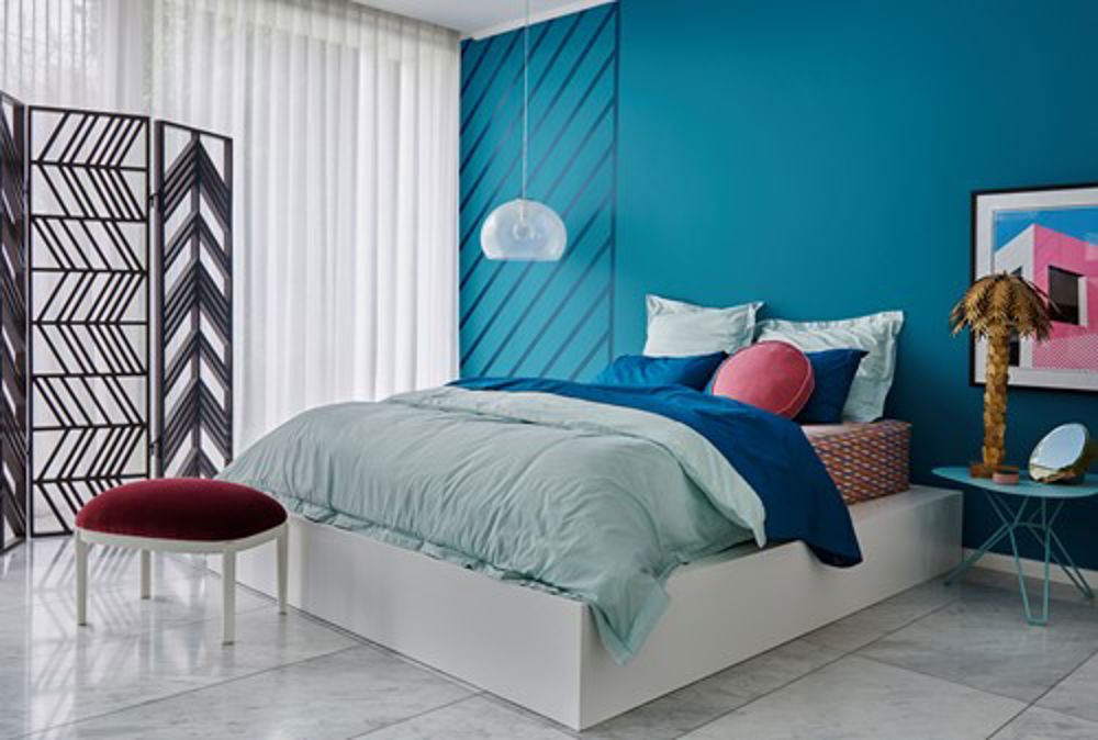
Channeling a holiday vibe, Escapade brings together a collection of bold and pale colours, creating a “lively interplay of pattern and colour that is at once both nostalgic but still fresh and fun”.
“It’s time to join the quest for fun and adventure. Escapade gives you permission to create your ultimate dream destination in full living colour,” the forecast says. Think mustards, pinks, teals, mints and blues in all stages of brightness.Essential
Inspired by a search for a more authentic existence, embracing natural and recycled materials, Essential celebrates soft tones. Pale pinks, greys, purples, blues and tans, as well as timbers and concrete or suede textures make up the look, inspiring calm spaces. “Beauty can exist in the most humble and quietest of moments,” the forecast says. “As we embrace the old as new, we repair our rifts with nature and move towards a more genuine and conscious way of living.”At David Reid Homes, we have the experts you need to design and build your dream home from start to finish. Contact us today to find out how we can help you.
Image Credits:
In-Blog: Reflect Palette, Dulux Goyder Green. Styled by Bree Leech. Photographer: Lisa Cohen. Armchair - Space; Chaise and Coffee Table - Voyager; Pendant Light - Statelight; Artwork - Stefan Gevers; Cushions - Zuster; Rug - Behruz Studio; Side Table - Anibou; Glass (on table) - Franque.
Cover Image: Escapade Palette, Dulux Bondi Pink & Dulux St Edmund. Styled by Bree Leech. Photographer Lisa Cohen. Pouf - Poliform; Divider - Globe West; Quilt Cover Set - Linen House; Fitted Sheets and Pea Cushion - Kip & Co; Pendant Light - Space; Side Table - District; Brass Lamp - House of Orange; Artwork - Ben Craven; Mirror Sculpture, Mirror and Jewellery Box - Designstuff.
Home Colour Trends 2018: Striking Balance with Dulux Forecast
Filed under:
- Design and Advice